Figure 2: Here is the WakeUp Coffee Sales Summary for the top 10 accounts by sales volume for the 4 weeks ending January 31st. Account H experienced the highest growth (+37.90%) with sales totaling $11,645. Account D had the highest sales volume at $547,265. Accounts J and E both showed significant declines, with -8.70% and -4.70%, respectively. The table includes sales volume, percentage change versus prior period, average number of UPCs, percentage of ACV selling, and price per pound.
Steps to Create this Graphic
1. Load Packages & Setup
Code
```{r}#| label: loadpacman::p_load( tidyverse, # Easily Install and Load the 'Tidyverse' ggtext, # Improved Text Rendering Support for 'ggplot2' showtext, # Using Fonts More Easily in R Graphs janitor, # Simple Tools for Examining and Cleaning Dirty Data skimr, # Compact and Flexible Summaries of Data scales, # Scale Functions for Visualization glue, # Interpreted String Literals gt, # Easily Create Presentation-Ready Display Tables readxl # Read Excel Files)```
---title: "WakeUp Coffee Sales Summary"subtitle: | Top 10 Accounts by Sales Volume: 4-week sales ending January 31stauthor: "Steven Ponce"date: "2024-10-09"date-modified: last-modifiedcategories: ["SWDchallenge", "Exercise", "Data Visualization", "R Programming", "2024"]image: "thumbnails/swd_2024_10 - Ex_046.png"format: html: toc: true toc-depth: 5 code-link: true code-fold: true code-tools: trueeditor_options: chunk_output_type: consoleexecute: error: false message: false warning: false eval: false# share:# permalink: "https://stevenponce.netlify.app/data_visualizations.html"# linkedin: true# twitter: true# email: true---**Update**: This post has been updated based on valuable feedback from the #SWDchallenge community. The changes include:- Reordering the table by Sales Volume to bring Account J, which has the largest negative percentage change, to the top for better emphasis.- Adjusting the color scheme to differentiate between positive and negative growth values more clearly, ensuring a more intuitive visual representation.- Highlighting Accounts J and H to emphasize the largest decrease and the highest growth, respectively.### OriginalThe goal of this month's Storytelling with Data challenge is to apply emphasis to the table shown below.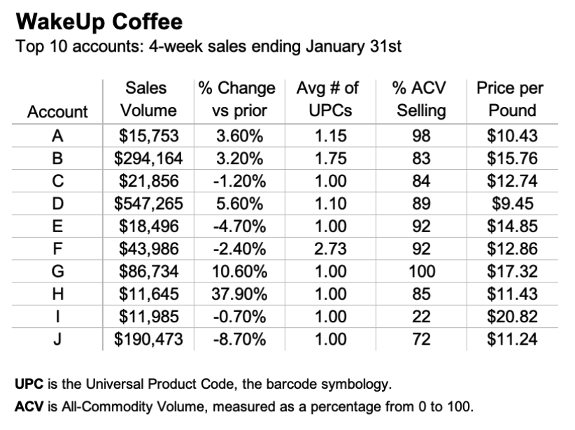{#fig-1}Additional information can be found [HERE](https://community.storytellingwithdata.com/exercises/apply-emphasis-to-this-table)### Makeover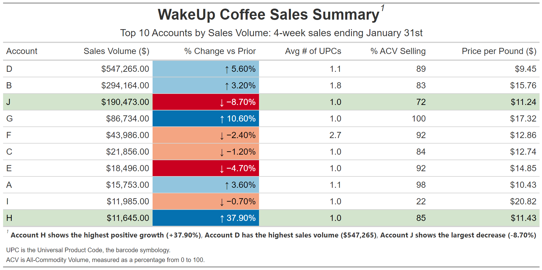{#fig-2}### <mark> __Steps to Create this Graphic__ </mark>#### 1. Load Packages & Setup ```{r}#| label: loadpacman::p_load( tidyverse, # Easily Install and Load the 'Tidyverse' ggtext, # Improved Text Rendering Support for 'ggplot2' showtext, # Using Fonts More Easily in R Graphs janitor, # Simple Tools for Examining and Cleaning Dirty Data skimr, # Compact and Flexible Summaries of Data scales, # Scale Functions for Visualization glue, # Interpreted String Literals gt, # Easily Create Presentation-Ready Display Tables readxl # Read Excel Files)```#### 2. Read in the Data ```{r}#| label: readsales_data <-read_excel( here::here("data/data_ex_046.xlsx"),range ="B8:G18", trim_ws =TRUE ) |>clean_names() |>glimpse()```#### 3. Examine the Data```{r}#| label: examineglimpse(sales_data) ```#### 6. Plot```{r}#| label: plot### |- Create a gt table ----sales_table <- sales_data |>arrange(desc(sales_volume)) |># Reorder by Sales Volume descendinggt() |>tab_header(title =md("**WakeUp Coffee Sales Summary**"),subtitle ="Top 10 Accounts by Sales Volume: 4-week sales ending January 31st" ) |>fmt_currency(columns =c(sales_volume, price_per_pound),currency ="USD" ) |>fmt_percent(columns =c(percent_change_vs_prior),scale_values =TRUE ) |>fmt_number(columns =c(avg_number_of_up_cs),decimals =1 ) |>text_transform(locations =cells_body(columns = percent_change_vs_prior),fn =function(x) { dplyr::case_when( x >0~paste0("\U2191 ", x), # Up arrow for positive values x <0~paste0("\U2193 ", x), # Down arrow for negative values,TRUE~as.character(x) ) } ) |># Emphasize Accounts H and Jtab_style(style =list(cell_fill(color ="#D3E4CD"),cell_text(color ="black") ),locations =cells_body(rows = account %in%c("J","H") ) ) |># Now add the color gradient for the % Change columndata_color(columns =c(percent_change_vs_prior),fn =col_bin(bins =c(-0.1, -0.04, 0, 0.065, 0.4), palette =c("#CA0020", "#F4A582", "#92C5DE", "#0571B0"),na.color ="transparent" ) ) |>cols_align(align ="right",columns =c(sales_volume, percent_change_vs_prior, avg_number_of_up_cs, percent_acv_selling, price_per_pound) ) |>cols_label(account ="Account",sales_volume ="Sales Volume ($)",percent_change_vs_prior ="% Change vs Prior",avg_number_of_up_cs ="Avg # of UPCs",percent_acv_selling ="% ACV Selling",price_per_pound ="Price per Pound ($)" ) |>tab_options(table.font.size ="small",data_row.padding =px(5) ) |>tab_source_note(source_note =html("<span style='font-size: 10px;'>UPC is the Universal Product Code, the barcode symbology.<br>ACV is All-Commodity Volume, measured as a percentage from 0 to 100.</span>") ) |>tab_footnote(footnote =md("**Account H shows the highest positive growth (+37.90%)**, **Account D has the highest sales volume ($547,265)**, **Account J shows the largest decrease (-8.70%)**</span>"),locations =cells_title(groups ="title") ) |>tab_style(style =cell_text(font ="Arial"),locations =list(cells_title(groups =c("title", "subtitle")),cells_column_labels(columns =everything()),cells_body(columns =everything()),cells_stub(rows =everything()),cells_source_notes() ) ) |>tab_style(style =cell_text(size =px(24)),locations =cells_title(groups ="title") ) |>tab_style(style =cell_text(size =px(16)),locations =cells_title(groups ="subtitle") ) |>tab_style(style =cell_text(size =px(14)),locations =list(cells_column_labels(columns =everything()), # Column labelscells_body(columns =everything()), # Data cellscells_stub(rows =everything()), # Row labels (stub)cells_source_notes() # Source notes ) )# Print the tablesales_table```#### 7. Save```{r}#| label: save### |- plot image ---- # Save the table as a PNGgtsave(data = sales_table, path ="data_visualizations/SWD Challenge/2024/",filename ="swd_2024_10 - Ex_046.png")### |- plot thumbnail---- magick::image_read(here::here("data_visualizations/SWD Challenge/2024/swd_2024_10 - Ex_046.png")) |> magick::image_resize(geometry ="400") |> magick::image_write(here::here("data_visualizations/SWD Challenge/2024/thumbnails/swd_2024_10 - Ex_046.png"))```#### 8. Session Info::: {.callout-tip collapse="true"}##### Expand for Session Info```{r, echo = FALSE}#| eval: truesessionInfo()```:::#### 9. GitHub Repository::: {.callout-tip collapse="true"}##### Expand for GitHub Repo[Access the GitHub repository here](https://github.com/poncest/personal-website/):::

